Visions of Reality BLOG
What's in an Ad?
What's in an Ad?... making darkness conscious...
The cover may 'say it all' but what part does a book advert play in carrying its message forward into the world at large? And what does it say about the underlying, often hidden, intention behind it? Perhaps insight into the artist's journey and the layers that make up the finished piece will provide a clue...
My adventure into the world of marketing continues...
Having reached a place of resolution regarding the cover of my book, I am now dipping my toes into social media and amazon advertising - a minefield I might add (no pun intended!) - and if it wasn't for my trusty marketer taking the helm at the start my little ship would have stayed floundering in the dock and I would never have left the harbour. But I did, and here I am steering a course to who knows where, using who knows what, with who knows who, and quite happy in the not knowing.
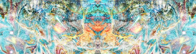
I began, as I often do, with creating an image, a vision of reality designed with intent, to convey a purpose; in this case to attract readers into taking a look at my book.
This is where I hit my first hurdle.
"The image doesn't really convey what I will be getting from the book", observed Katie, my marketer. "Think about how this book will genuinely help people. What can you share about the book, or from the book's content, that will really help people in their day-to-day lives as and when they see your content?"
After, I'd closed my mouth and picked myself up from the floor, I had my customary rant. "Humph, I really like this image... it has so much in it... and every element is significant... and now I've got to find inspiration to create another one... AND I've got to think of something that potential readers might want to go with it...!" Another humph, rapidly followed by another. I allowed my resistance full flow as I jumped on the hamster wheel of, "no, no, no... NO. Not again!" And then, as suddenly as it begun, it stopped. From out of nowhere... from within the ensuing silence... came this...
"When you can't see the wood
for the trees..."
You see, once again, I knew she was right. I knew, even though the image felt right, the words that went with it didn't quite cut it, and in that there was a stuck-ness. I also agreed with her when she said, "the image is a bit dark", which I conceded might appear intimidating to some. Katie, whilst presenting yet another challenge to all I held most dear, freed my inner creator. Furthermore, without even knowing it, she'd introduced a new way for me to approach marketing - sharing! Would you credit it? I had my way in. Now, I could do what I loved most... PLAY and SHARE! In the end, my new 'advert' fell into place effortlessly, with the solution, 'Walk in Beauty', appearing as part of the process. I was pleased, more than pleased, with the end result.
"I did a double-take
when I noticed the layers"
However, there was more to come. I did a double take when I noticed the layers making up the finished artwork - they had their own story to tell, which not only linked the two versions of my ad, but when I looked at the geometric 'womb of creation' tying them together there was a far big bigger waiting in the wings.
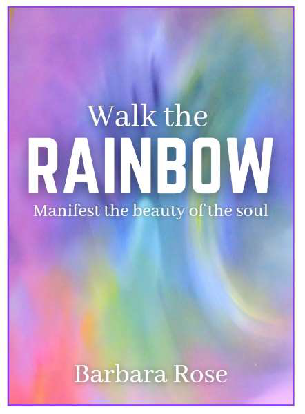
Walk in Beauty - the subtle in-between
Layers and qualities embodied in the finished piece
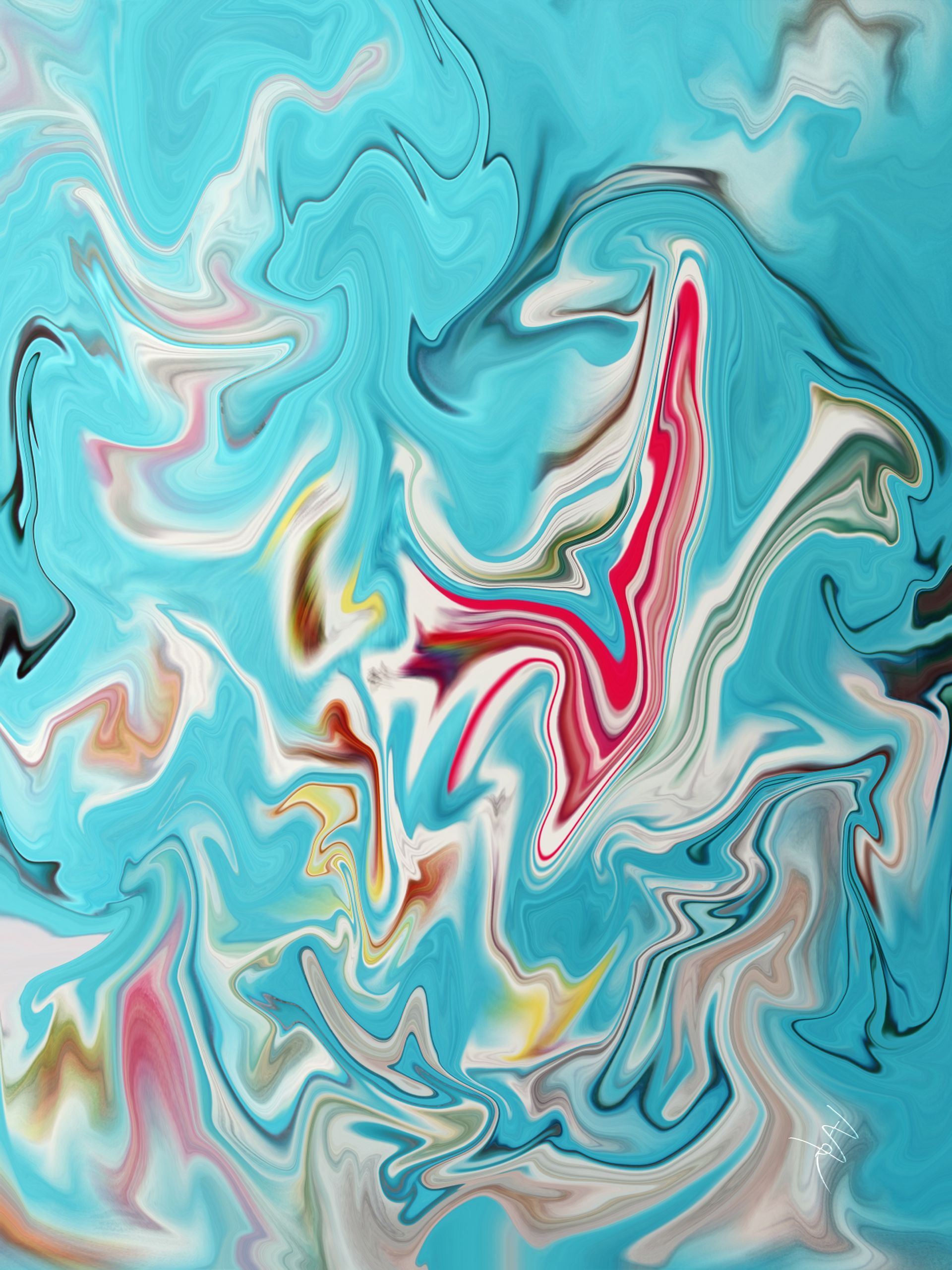
Roots
As source artwork for my first advert, it now forms the foundation, the root, for the second. Lets take a look at its significance.
Roots is a calling to the past. "Unconscious roots, source of all psychological and emotional entanglements, are anchored in the past, but when held under the lens of clear-seeing, they cease their hold upon the present. If, at the same time, they are embraced inside a heart of compassionate acceptance, they dissolve into nothingness, becoming one with the whole tree".
Walk the Rainbow is about embracing the light within but how can you possibly walk in light if under-processed emotional baggage and mental constructs lurk in the substrate?
Enter the role of awareness. When consciousness is engaged in illuminating the dark - your shadow-self - it becomes conscious. It is light. And when darkness is light, life is filled with magic. The wonder-filled child, having no baggage, is then able to claim its birthright and return once again to innocence.
Can you see how all these elements are within my first 'Adventure' advert? And why, its qualities have such an important role to play in carrying its message forward. No wonder it snuck under the radar to claim its place at the root of this one!
Change
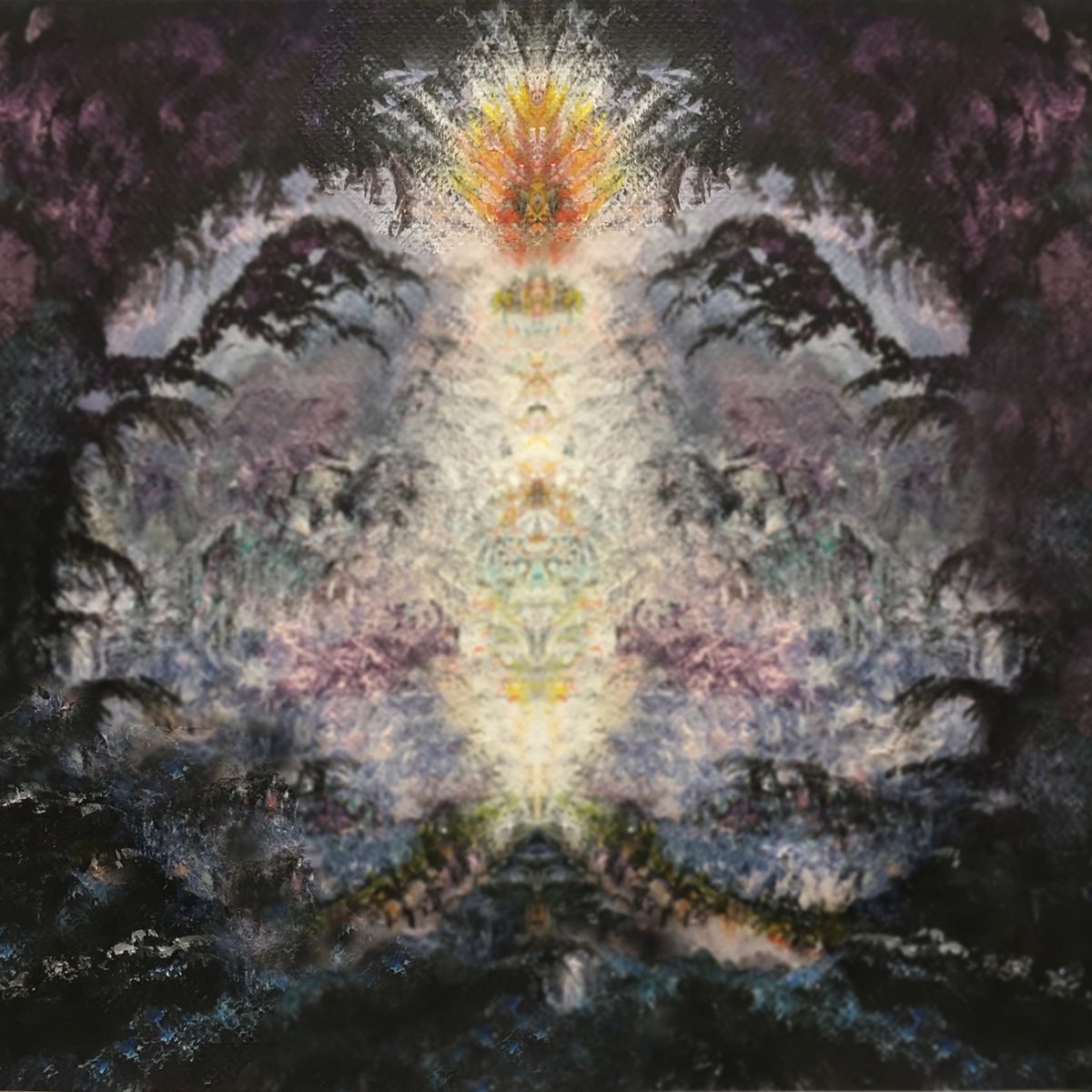
Is the only image of the three not to feature in Walk the Rainbow - at least not directly; it is one of the layers in As Above So Below, and has been recently released as a piece in its own right following a canvas request from a friend.
Its title takes its name from the energy of the layer beneath - cards from a Galactic Heritage card reading - and embodies the essence of Andromeda, sister galaxy to earth's, Milky Way.
The reality of Andromeda, according to the author of the Galactic Heritage cards*, is one of constant change. Not change as we know and understand it but one where the fluidity of its environment is such that the only way to navigate is by means of a strong inner compass rooted in consciousness.
In view of the constantly shifting Andromeda realities it comes as no surprise to see that Change, as a
vision of reality, is perfect for bringing together the qualities, not only of the images, but also those of their innate essence. Given the twists and turns, ups and downs, of the publishing industry it is a most fitting ambassador to carry the message forward.
*Lyssa Royal Holt
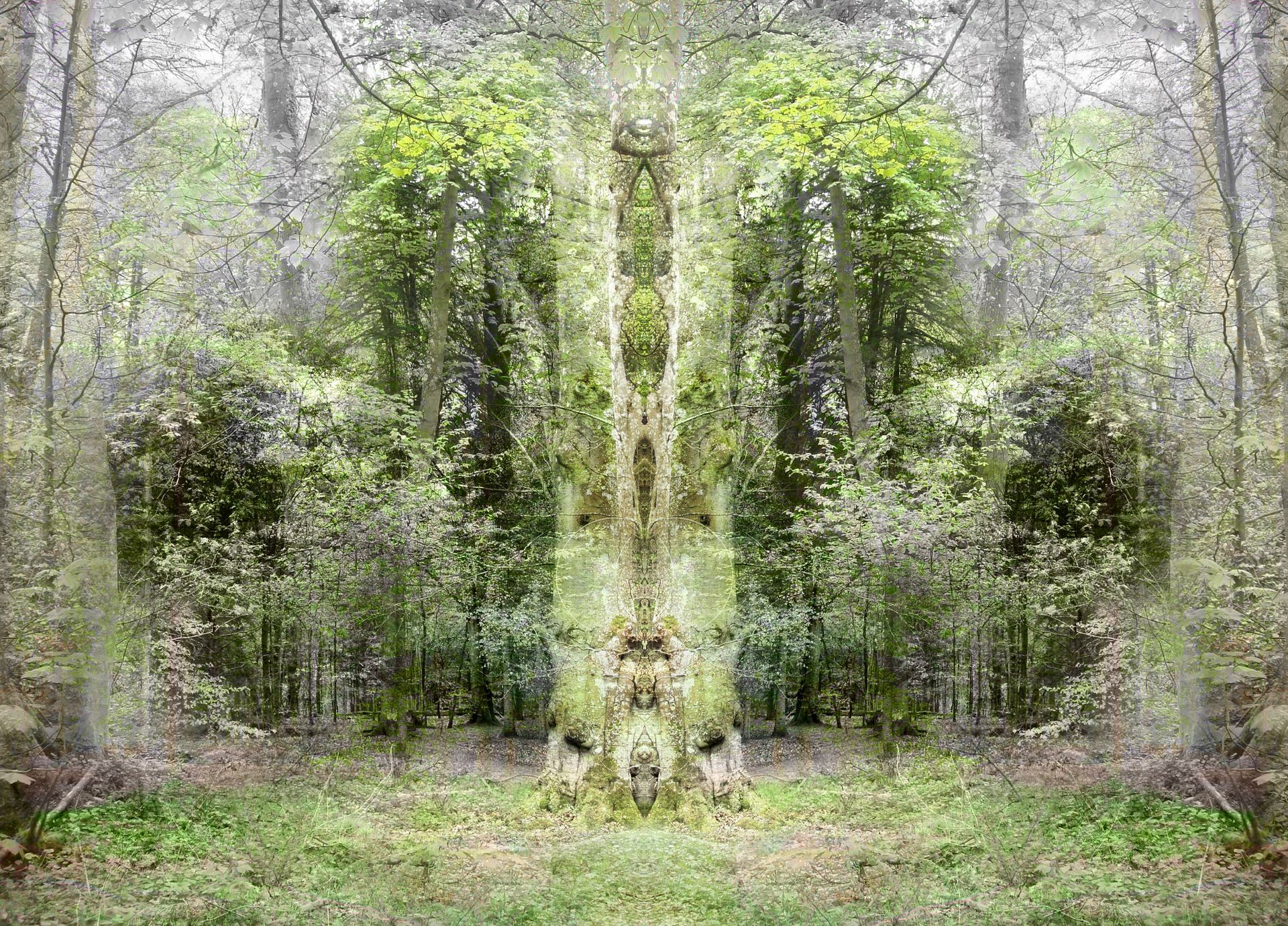
Wallington Wood
Wallington Wood introduces an element of surprise. It takes its name from a well-renowned beauty spot in the north east of England, and its story arose following a visit whilst visiting family. I was so mesmerised by its other-worldly presence, I sat down upon a fallen log to absorb its magnificence.
"A brief encounter with solitude, taken at an opportune moment in an inspired wood, brings nature’s unsung heroes to the forefront of a mind otherwise closed to their presence. As the dreamer bathes in wonderment at nature’s beneficence, veils between worlds are miraculously drawn aside and transportation to another dimension in space and time is suddenly made readily accessible. Creatures never before encountered, not even in the most vivid of imaginary tales, are clearly visible, beings whose presence is defined through subtle variations in light and sound are made tangible to the senses and, most astounding of all, the Spirit of the Wood is known. Hailed with gratitude inside a heart steeped in humility, the one who paused… just for a moment… is left forever changed."
Its place in my new ad artwork bears testament to itself. What better place could there possibly be to 'walk in beauty', than taking a stroll through a magical wood?
Two become one
The vesica piscis, known as the womb of creation, shows how seemingly apparent opposites may be united in harmony to present a third, more creative, option. Two circles of equal radius are joined by their centres to create the inner 'eye', a space where 'magic' happens and infinite potential exists. Also known as the 'Eye of God' it features in many of the visions in Walk the Rainbow - zoom in on Wallington Wood and you will see it at the centre of the 'Spirit of the Wood' - as well as on the front cover of the book and in place of prominence in my first advert. It's significance, in book, adverts, and sacred geometry, cannot be over-stated. It may not be obvious in the ad, 'Walk in beauty', but its essence, its Spirit, and its energy are prevalent throughout. You just have to open your eyes and look a little deeper... or read this blog!


One last thing...
This blogging journey began when I was asked by my marketer to change my cover. Alongside an idea of how a replacement might look Katie suggested I use one of my paintings to create a similar abstract image; making the title and author stand out more was also part of the remit. Well I may not have changed the cover of my book but when I look at Katie's cover suggestion (including the colour) and my new ad, I find there to be a merging of worlds. All has come full circle. Shifting paradigms, illumination of shadows and dancing with rainbows... Oh, my! what an amazing journey...
Who would have thought pausing for a while in an enchanted wood, or taking a moment to look deeper into the layers making up an ad would take me straight to the heart of Walking the Rainbow, and with it the core message of my book! This is 'manifesting the beauty of the Soul'... and life expressed as a 'way of wholeness...' Makes you want to explore some more, doesn't it?
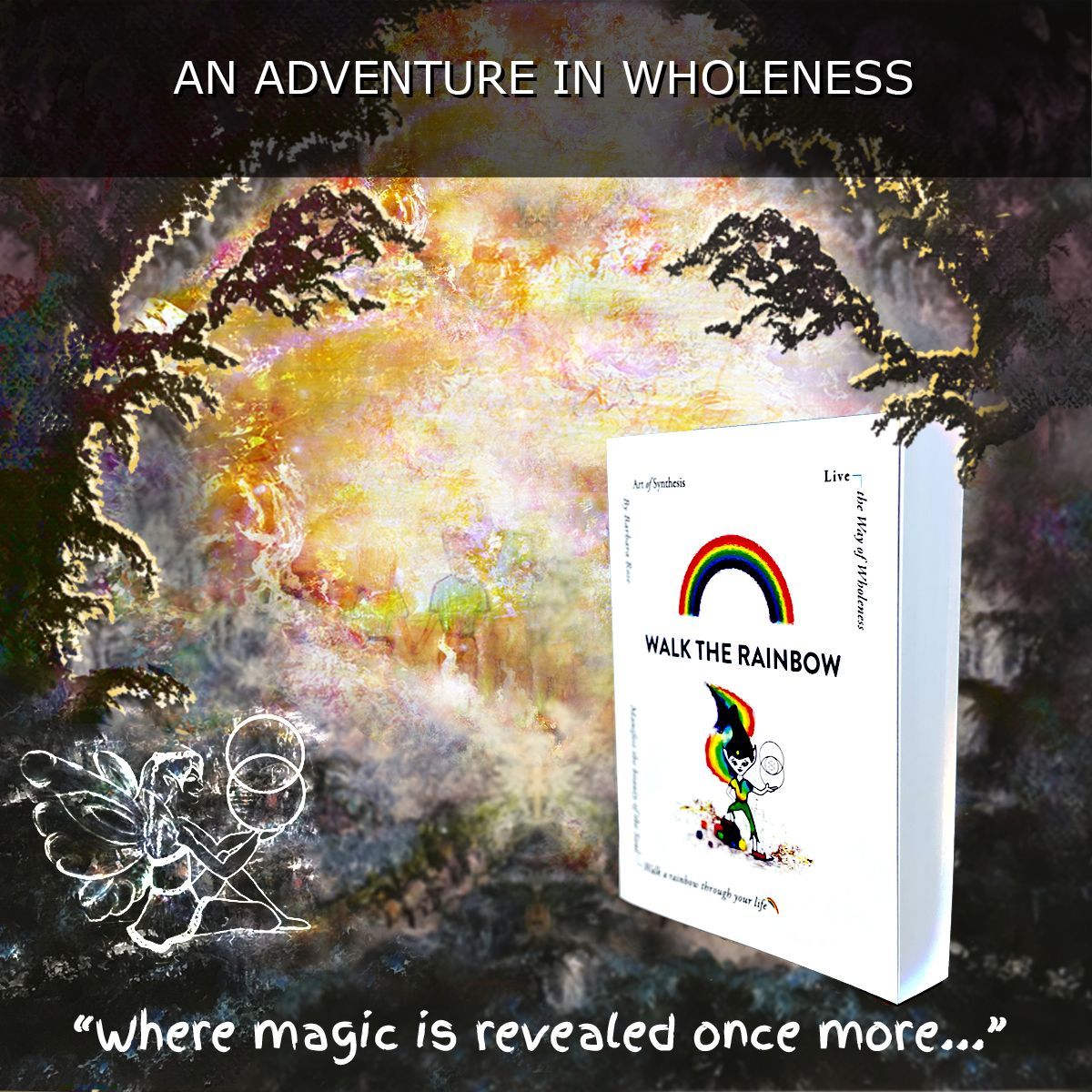
Walk the Rainbow includes 150+ original artwork and detailed graphics in full colour.
Available in paperback and eBook
Learn more here
Did you enjoy this blog? Why not sign up to our regular newsletter and join our community?
Read about everyday life, its impact upon you, our world, and, especially, its relevance to the unfolding of consciousness within a far bigger picture. Take the insights you have gained through reading Walk the Rainbow to the next level or learn more about its contents. Original artwork, sacred geometry, captivating stories, reflections on life, and inner dialogues with the soul, are just some of the highlights explored in recent newsletters. As a thank you for trusting us, upon confirmation of your details, we'll send you three gratitude gifts unique to subscribers within the space of a week. After that, rest assured, you won't be bombarded with emails - once every 5-6 weeks is the norm.